
The Power of Color |
|---|
|
A Primitive Trait Diving In Contrast A Sunglasses Experiment The Color Wheel Layering Colors Mixing Colors The Paper Additional Reading |
|
It's difficult to say enough about the impact of color on a painting. Color sets the mood, grabs attention, and stirs the emotions. You'll be amazed how a $2.00 set of watercolors and a $.50 brush can produce an image that will stop people in their tracks. Paintings with vibrant colors touches the human spirit in a very personal way. Comments: |
 "Red Roses and the Morning Light" — Watercolor, 2002 by PB |
A Primitive TraitBecause the eye is so specialized in its optics and color recognition, i.e., reds fire specific cones in the back of the eye, it leads to theories about how our optical capabilities developed. It may be that early humans with the best red perception found more ripe fruit, and that physical ability evolved into our color sense. Comment: We should probably leave those questions to the anthropologists. The facts are that the perception of color is physically woven into our response systems. Diving InA wealth of watercolor technique books discuss color theory about mixing colors, the impact of contrast, and ideal lighting. Many of these insights can also be learned from just playing around with the color combinations. Let's try an experiment with different approaches. The goal is to see for yourself how colors behave and interact. In order to see differences, we need a way to observe the impact of changing colors on a similar scene. To that end, you need to have ten to twenty pages with the same scene. Instantly, the color contributes to the story. Yellow adds a different feeling than brown. Remember the goal — add life to the center of interest. With color on each of the twenty copies, lay the pages out. See which ones jump out at you. Which ones are boring? The idea is to complement the main color in a way that draws even more attention to it. Again, lay the pages out, and see which ones jump out at you. Which ones are boring? After the exercise you probably know a lot more about color. Comments: You Can't EraseBecause it's difficult to erase colors, most artists end up going with the first colors to hit the paper. For that reason, they don't experiment as much as they could. It means that insight and discovery take a longer than they should. The above exercise, with the opportunity to try twenty variations is useful in everyday artistic growth. When you create a design that you like, get twenty black and white copies made. If it's large, take a photo and use the print for making copies. Who knows what you may uncover? 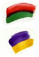
ContrastWithout contrast you couldn't see the painting. Think about the extreme for a moment. If you painted a red flower, it could be quite elegant. However, if the background was red, it wouldn't make much of an impression. In fact, some might not see it at all. Okay, red on red is the extreme. Purple on black is close, but early Web sites used this combination. The result was unreadable. In paintings, contrasts create excitement. Inserting shadows and complementary colors adds power to a painting. A Sunglasses ExperimentWorking artists understand the importance of contrast. They've read about it; listened to lectures on it; and hear it come up in reviews. But they often forget the power of contrast. One experiment makes the point in striking fashion. It goes like this: Typically, the results are dramatic. Viewing the scene with the naked eye is okay. With the contrast that the glasses add, however, the scene explodes into 3D and active shapes. The scene is the same. Only the contrast was changed. 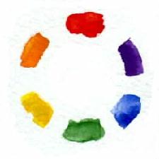
The Color WheelIn physical terms, our sense of color originates with optical sensors (rods and cones in the eye) processing light at different frequencies. Obviously, similar frequencies show less contrast. That makes sense. Rather than going in tables of frequencies, the color wheel offers a simple picture of these relationships. On the wheel, colors on opposite sides create the best contrasts and complimentary effects. Images with these combinations appear more dramatic. Something about our optical perception has heightened our sensibility to these particular contrasts. Examples: Layering ColorsBecause watercolor is transparent, it provides a unique opportunity for enriching colors and increasing contrast effects. Let's say that you use red to represent a piece of cloth. A layer of blue red can emphasize a fold. Another layer of violet red can introduce shading. A final layer of dark blue and red can exaggerate the shadow near the focus point. Layering is powerful and one of the more fun parts of watercolor. However, it's easy to get caught up in the layering technique and apply emphasis everywhere. Remember to focus on the essence of your painting. Mixing ColorsEvery artist should learn to mix the primary colors (red, blue, yellow) to create other colors, such as, green and orange. This will quickly become second nature. Use the color wheel if a conceptual framework helps you work through this. Opposite colors on the wheel complement each other. Christopher Schink does an excellent job illustrating the effect. Comment: A strange dynamic can surface when the color wheel is introduced. Many beginning artists want nothing to do with it. The suggested color combinations are seen as a distraction from their personal experimenting. Fair enough. At this point, the color wheel might be a distraction. That reaction probably isn't so bad. After all, the goal is to surface your creative spirit. Wanting to do it your way is okay. You may wish to explore the interaction of colors in an unstructured way. Color Combination Exercise Armed with these color contrast results, you have the same information as the color wheel. (Just out of curiosity, you may want to compare your results with the wheel.) The PaperWatercolor paper is like a child. It will throw a tantrum at the worst time, and at other times, it will bring out the best in you. One paper will create a flow that adds depth and character to the washes; another will absorb so much color that the images will fade before they're dry; and yet other papers will help the image jump out at the viewer. If you try to fight the impact of the paper, you will go mad. Understand that each paper has strengths and weaknesses. The more you can the leverage their characteristics the more powerful your paintings will be. Paper samplers offer the chance to experiment. Remember, papers aren't inherently bad; they may just not work for you at the moment. What's NextIf you've been following along and doing the exercises, you now have an eye for finding a painting's center of interest, a sense for the impact of color, and a basic understanding of color interactions. That's a lot. You have one more major area — eye movement in a painting. Focus and color are important, but without a design that captures the viewers' attention, their eyes will move on and so will they. Additional Reading
Color and Light: For the Watercolor Painter
by Christopher Schink. Watson-Guptill, 1995.
Watercolor Workbook: A Complete Course in Ten Lessons
by Anne Elsworth. Reader's Digest, 1999.
Chinese Painting Techniques for Exquisite Watercolors
by Lian Quan Zhen. North Light Books, 2000.
Impressionist New York
by William H. Gerdts. Abbeville Press Publications, 1994. Hard to Find Books Most books can be ordered through Amazon.com by clicking on the book's title link. If the book is not available or out-of-print, Amazon.com and Barnes and Noble list vendors with used copies. | AWSS Main | Previous Section | Next Section | Feedback: Patricia Bason |